Fa·vor·it·ism, n.
One image is worth a thousand words
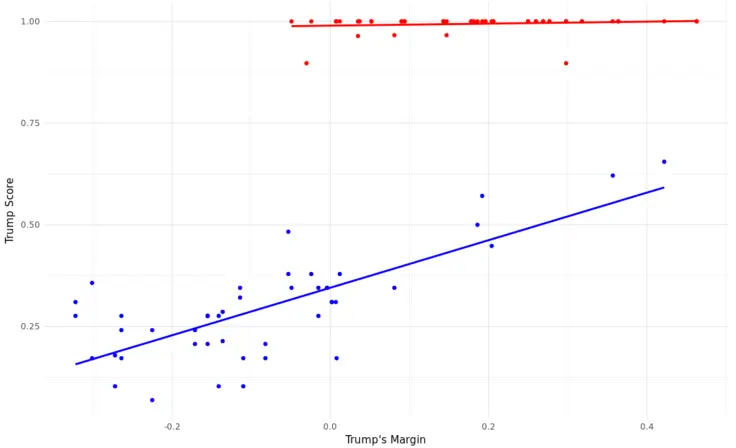
This is a plot showing how often senators vote in line with Trump as a function of Trump’s margin in their states. Each point’s color also indicates the Senator’s party.
Data collected and maintained by FiveThirtyEight at Tracking Congress In The Age Of Trump. Extracted with an R package I created.
You can also see the full dataset on Kaggle.