Space and time in R
While creating a Kaggle Kernel for the Killed by Police, 2015–2016 data set I had the idea to visualize the data as an animation. Since it contained information about every killing by police officer between 2015 and 2016 with the coordinates of each death, I figured each frame would be a plot that represented all deaths up to a particular day. It sounded very straightforward, but in the end it took more time than I expected.
Creating the static plot
The first step was making a static plot so that I could have an idea of how I wanted the final product to look like. I had never plotted any geographic data with R before, so it was a while before I was able to get anything working. I decided to create a base layer for the plot and then worry about the data.
plot_deaths <- ggplot() +
  geom_polygon(data = map_data("usa"), aes(long, lat, group = group), fill = "#e6e6e6") +
  theme(axis.text.x = element_blank(), axis.text.y = element_blank(),
        axis.title.x = element_blank(), axis.title.y = element_blank(),
        axis.line = element_blank(), axis.ticks = element_blank(),
        panel.background = element_blank(), panel.border = element_blank(),
        panel.grid.major = element_blank(), panel.grid.minor = element_blank(),
        legend.position = "none") +
  coord_quickmap()
The code above creates this image:

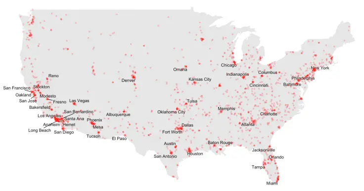
Then I filtered the data set so that it only contained information about the continental US, which I called cont_deaths. After some minor tidying up, I also created a list of the cities (and their respective locations) that had more than 5 killings registered in the data set: deadly_cities.
plot_deaths +
  geom_text_repel(data = deadly_cities, aes(long, lat, label = city), size = 4) +
  geom_point(data = cont_deaths, aes(longitude, latitude), alpha = 0.2, color = "red") +
  ggtitle("Killed by Police (showing cities with most deaths)")
I tried using ggplot’s geom_text but many cities overlapped, so I went looking for a solution and ended up finding out about ggrepel. With ggrepel::geom_text_repel, the plot ended up looking pretty nice.
In the image below, the named cities are the ones with 5 or more deaths.
I was very satisfied with the results, so I decided to start working on the animation.
Creating the animation
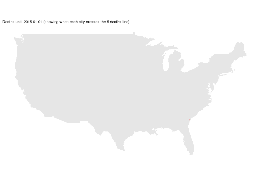
To create the animation I used the animation package and installed ImageMagick. With animation::saveGIF all I had to do is loop through the plot I wanted for each frame and the rest was taken care of.
saveGIF(for (i in 0:730) {

  # Filter deaths up to a certain date
  time_deaths <- cont_deaths %>%
    filter(date <= ymd("2015-01-01") + i)

  # Get the cities that have already had more than 5 deaths
  time_cities <- deadly_cities %>%
    left_join(time_deaths, c("city" = "city", "country.etc" = "state")) %>%
    group_by(city, country.etc) %>%
    summarise(count = n(), long = long[1], lat = lat[1]) %>%
    ungroup() %>%
    mutate(alph = count > 5)

  # Plot deaths
  print(plot_deaths +
    geom_text_repel(data = time_cities, size = 4, segment.alpha = 0,
                    aes(long, lat, label = city, alpha = factor(alph))) +
    scale_alpha_manual(values = c(0, 1)) +
    geom_point(data = time_deaths, aes(longitude, latitude), alpha = 0.2, color = "red") +
    ggtitle(paste0("Deaths until ", ymd("2015-01-01") + i,
                   " (showing when each city crosses the 5 deaths line)")))

}, "deaths.gif", interval = 0.005, ani.width = 900, ani.height = 630)
In this snippet I loop through the 730 days of the data set and plot only the deaths up to that date. I also check to see if any city has crossed the 5 deaths line to start showing its name.
The final animation looks like this:
Final thoughts
Trying to create this animation was a very interesting experience. I had to look-up most of the stuff I was intending to do, but in the end I learned a lot. Special thanks to Rob Harrand, whose Kernel taught me to use the animation package.
The hardest part by far was getting the labels in the animation to behave. Since ggrepel::geom_text_repel finds the best spot for each label, as new cities crossed the 5 deaths mark, the other labels would jitter for some frames. I fixed this issue by having all of the labels be plotted right from the first frame, but leave the cities with 5 deaths or less with their alphas equal to zero.
If you want to take a look at the full source code, just head over to my Kernel. And if you want to take a look at other visualizations head over to my blog.